2025
Silverbird Cinemas — A redesign concept. Standing ovation. Anyone?
Could the old site be better?
Look, nobody goes to the cinema just for the info. It’s the lights, the sound, the drama. But Silverbird’s old site? All info, no vibe. It didn’t sell the experience - it just listed it. Silverbird’s in-person experience is premium, but the website? Meh. So I set out to fix that - to make the site feel like the trailer to a great night out. More feeling, less digging. Fewer clicks, more “ooh what’s showing?”
Did you do any research?
Absolutely. I needed a clear understanding of what users wanted and why
so many cinema sites still looked like they were coded when WhatsApp had
a subscription.
I kicked things off with a Discovery Phase (fancy
way of saying I asked some questions and made some observations). I studied
what the competition was doing, what Silverbird’s site was not doing, and
what users were quietly suffering through. Most platforms? All flash, somewhat
okay function. The ones that looked great on desktop fell apart on mobile.
Checkout flows felt like filing taxes. And trailers? Hidden like post-credit
scenes.
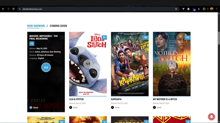
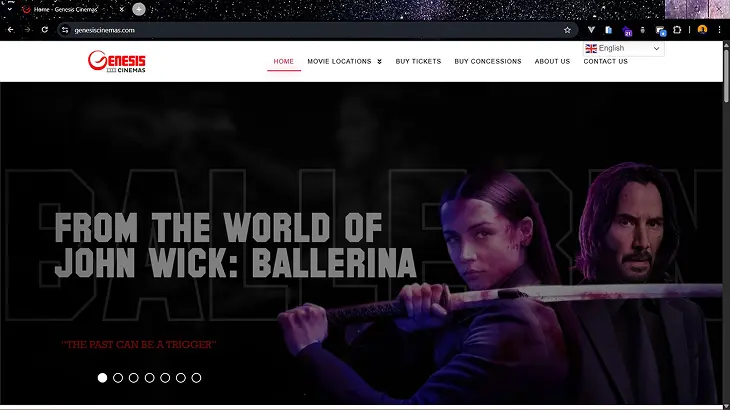
I broke down the competition:
Taking lessons and opportunities
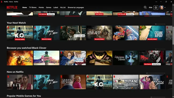
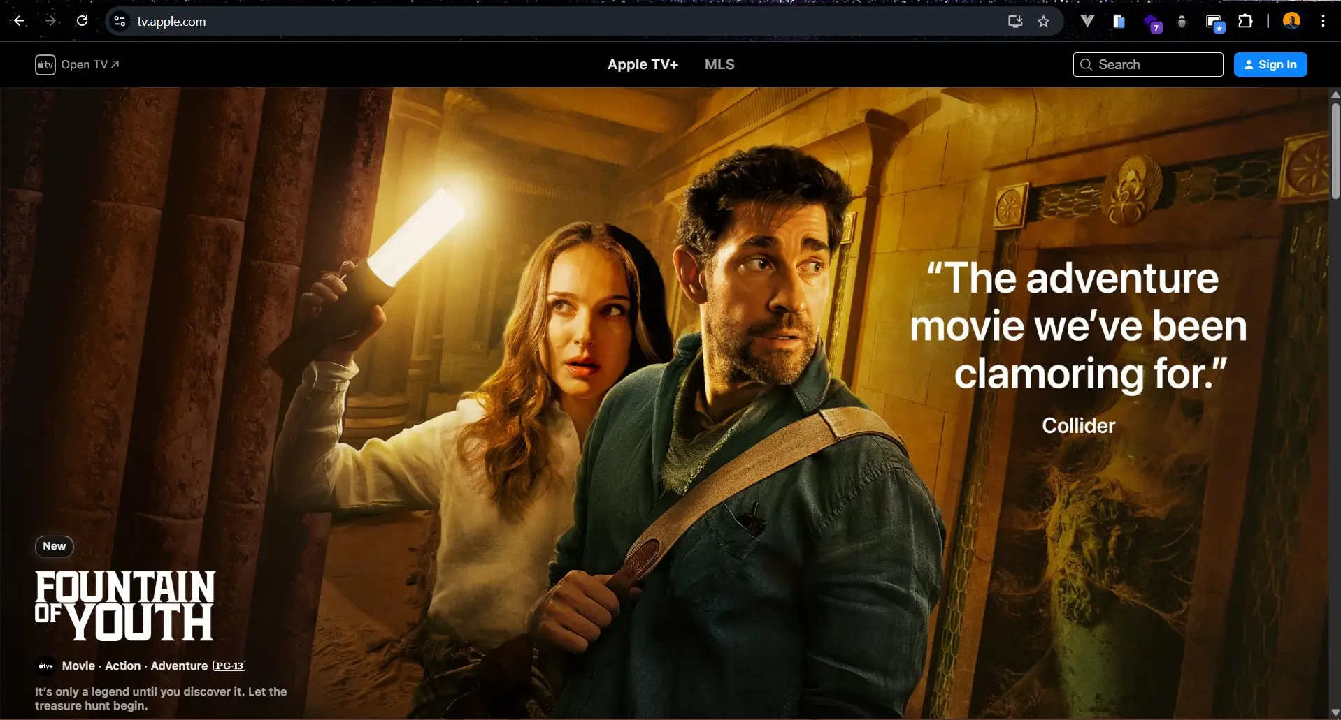
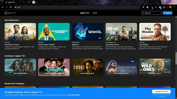
from Vue Cinemas, Cineplex and Genesis Cinemas. I peaked at platforms like
Netflix and Apple TV to see how the pros show content and move users from
“ooh, this looks good” to “take my money please.”
I also mapped
out four main audience types:
The Chill Scroller – just wants to see what’s playing without going past
3 clicks.
The Over-Planner – low-key building a whole date itinerary
around this.
The Movie Nerd – if IMDb had a human form.
The
First-Timer – needs a “Start Here” button and possibly a hug.
The big takeaway? People want less effort, more excitement. So I designed
for that. Less “wait, how do I book this?”, more “ooh, let’s go tonight.”
What was the redesign approach?
I treated this redesign the way a good director treats a film: every
scene (or in this case, screen) needed purpose, mood, and that “oof”
factor. The goal wasn’t just to “make the site look nice.” It was to
turn the website into a trailer for a great night out. One that makes
you say, “This? This is worth putting pants on for.”
I drew inspiration
from high-drama, high-polish experiences like the SpaceX website. Because
if they can make rocket science feel sexy, I can make booking movie tickets
feel less like online banking.
Here’s what I focused on:
Embrace the drama:
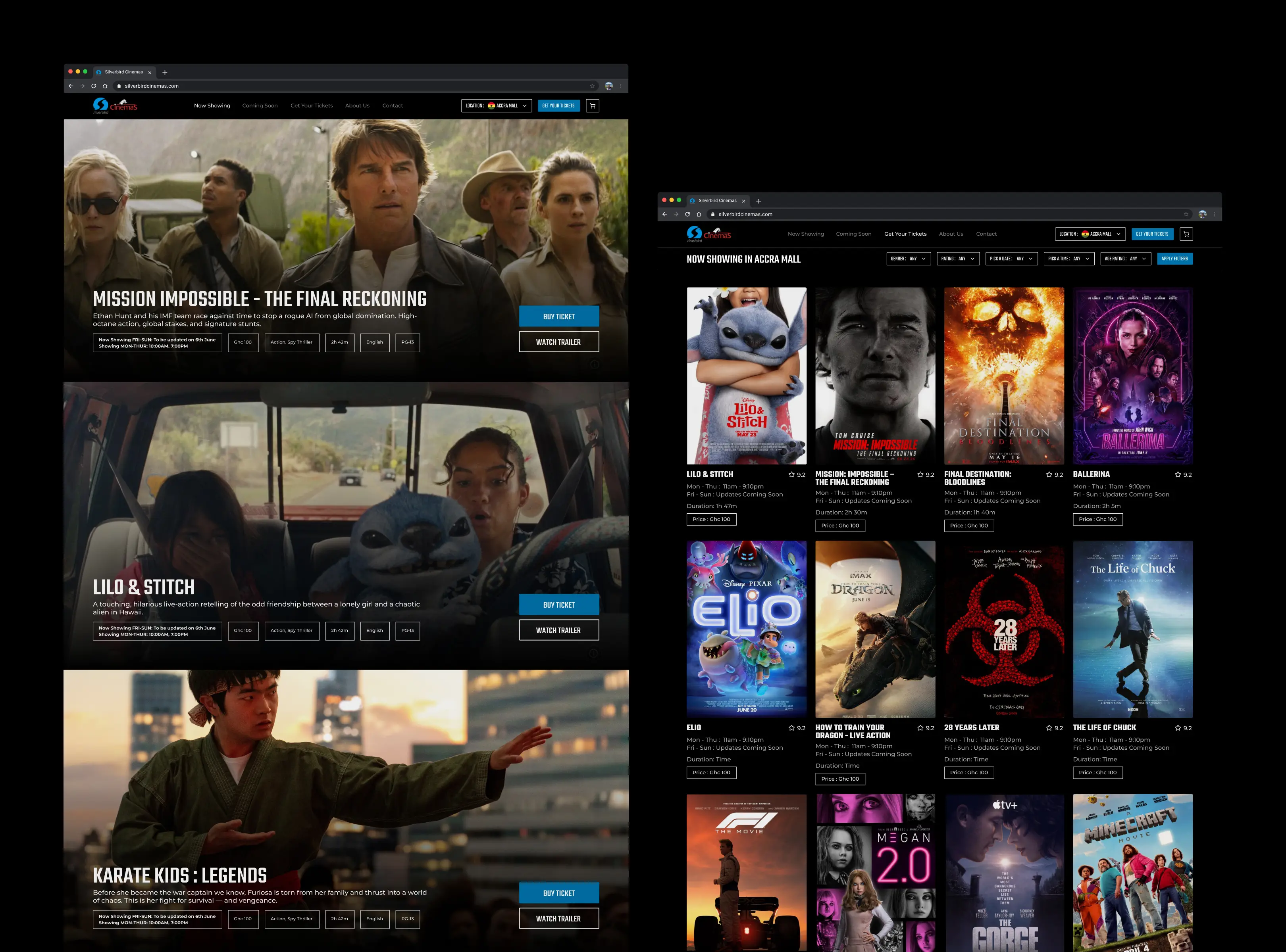
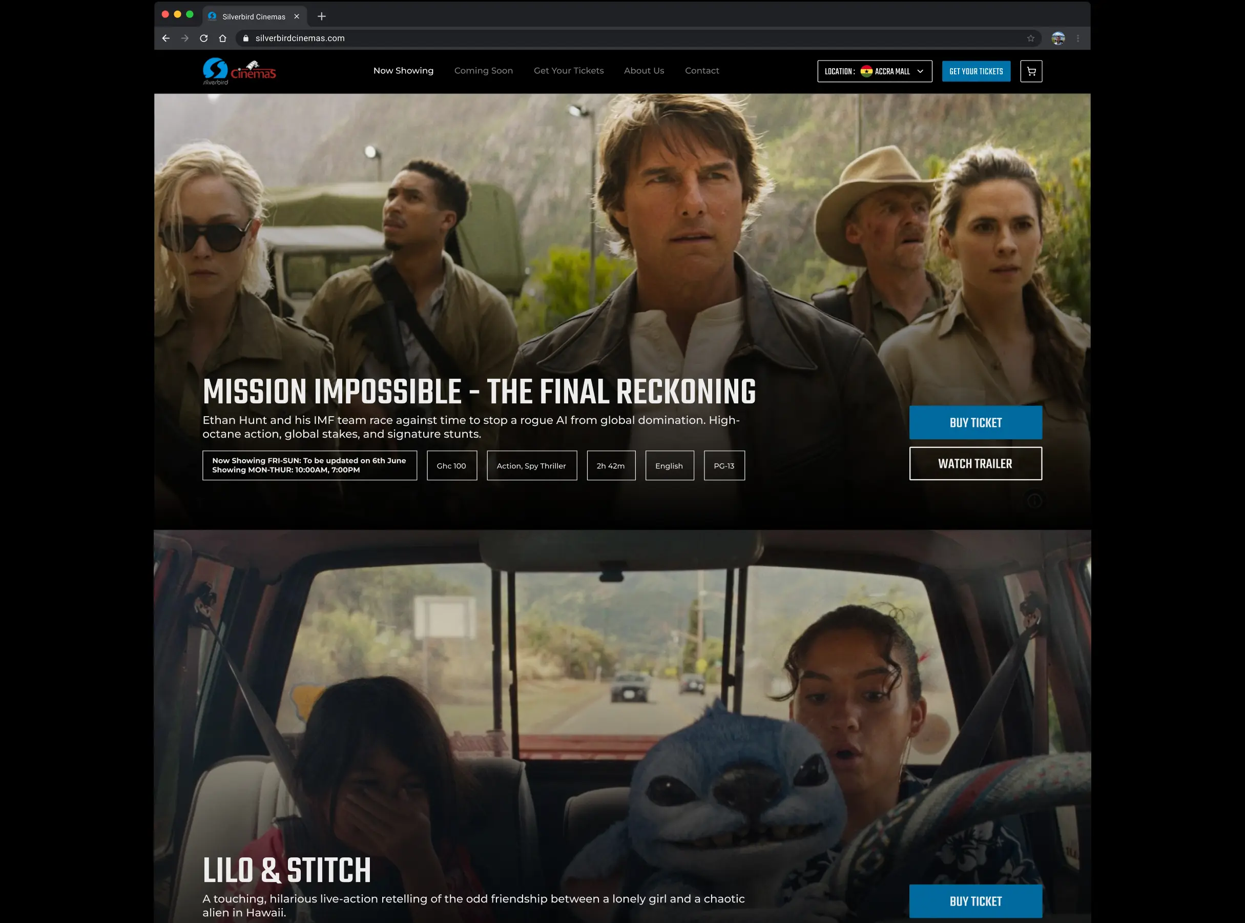
Dark mode, bold
type, big visuals. It had to feel premium, cinematic, and a little like stepping
into a dimly lit theatre just before the movie starts.
Simplify the path to popcorn:
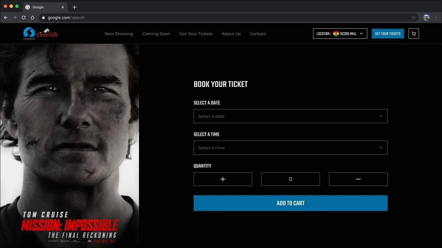
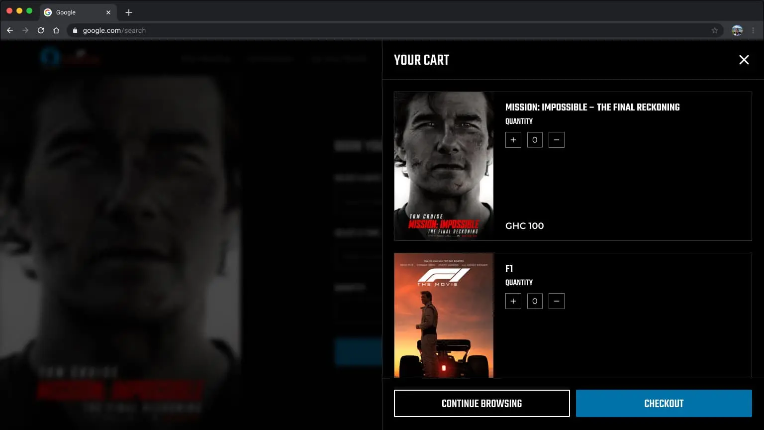
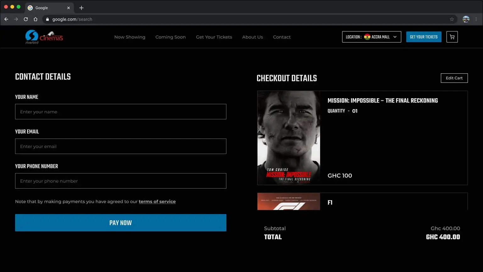
Booking flows were reimagined. Less
“click here, no here, wait go back” and more “boom, done.”
Design for discovery, not confusion:
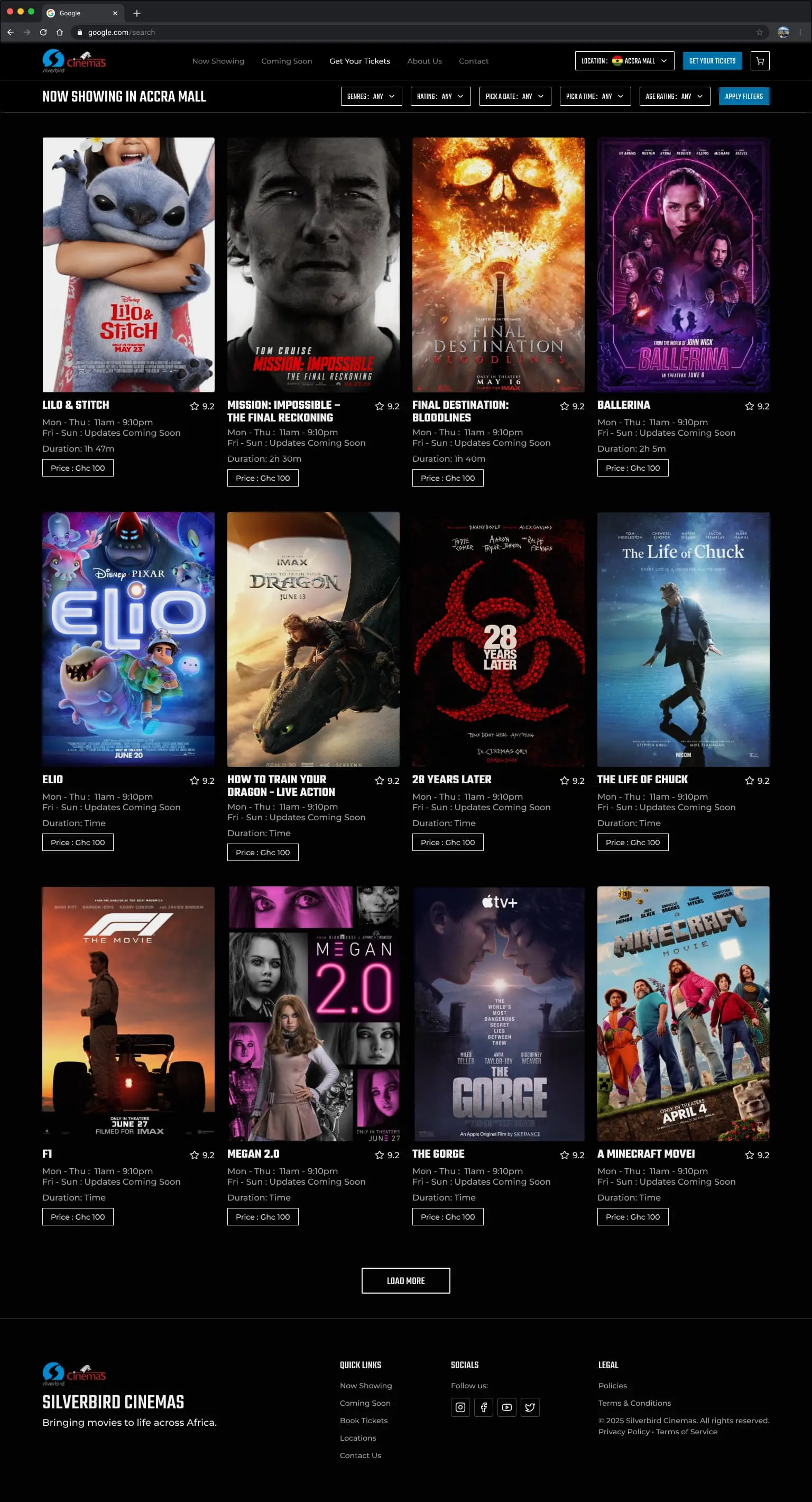
The homepage leads with
Now Showing - full screen layouts with clear call to actions for booking
tickets and viewing trailers.
Make mobile not suck:
Special
attention was given to small screens, fat thumbs, and short attention spans.
The result? Simple, well organized layouts that works just as well on a phone
in the backseat as it does on a laptop at work.

We didn’t overload it with 37 tabs and 12 dropdowns. The IA was built around what real humans need:
- Now Showing - What you can watch right now
- Coming Soon - What to look forward to
- Get Your Tickets - Where the magic (and payment) happens
- About - Who the h*** are these people!!!
- Contact - “Hi, I need help with...”
How did you approach the user flows?
Firstly, what’s the ideal flow for booking a movie ticket?
The ideal
flow is dead simple. You land on the homepage, see what's showing, click
“Book,” go through a checkout process and pay. That's it. Fast, focused,
frictionless.
Lastly, how should users browse?
I split
it into two clear paths: “Now Showing” and “Coming Soon.” You can filter
by location and if you’re just browsing for vibes or planning a future movie
night, “Coming Soon” has trailers and premiere date reminders to keep you
hyped.
How does the new design solve real problems?
To answer this, Usability testing gave me more insight to specific
questions:
Is it easier to find showtimes?
Showtimes
are now front and center. No digging. The homepage shows a catalogue of movies
playing today, with a “Book Now” and a clear “Watch Trailer” button to satisfy
any lingering curiosity. Everything was designed to be location aware considering
Silverbird Cinemas has multiple branches spread across different countries.
Why does the layout feel more immersive?
We ditched the
clutter and went simple & cinematic. Think full-width trailers, high-contrast
dark mode, bold typography, and poster-led layouts. You feel like you're
in the movie world already - not browsing a spreadsheet of listings.
Where did visual clarity and hierarchy improve?
Every section
has a clear purpose. Movies have visual priority, actions like “Book” or
“Watch Trailer” are immediately visible, and supporting info like duration,
rating, and genre is organized cleanly. On mobile, it’s all thumb-friendly
- nothing crammed, nothing hidden.
Why does this redesign matter?
Why does this redesign matter?
Because the old site was hiding a great
experience behind a bad one. Now, more people can find and book movie tickets
faster, especially on their phones - which is where most users are coming
from anyway.
What changed for mobile users?
Everything.
The new design feels like an app - not a squished desktop site. It’s smoother,
faster, and actually built for thumbs. That alone can drive up bookings.
What does this redesign say about the brand?
It says
Silverbird isn’t stuck in the past. The site now feels like the premium in-cinema-experience
: sleek, immersive, and modern. It builds trust, excitement, and relevance
-especially with younger audiences.
What did you learn during this project?
That keeping it simple is actually the hard part. I wanted it to feel
cinematic, but not at the cost of usability - and balancing those two
worlds took more iteration than I expected.
Visual hierarchy. Every little layout decision changes how people
navigate and feel. I found myself trying to be precise with spacing, scale,
and flow more than fancy effects.
And Yeah - that you don’t
need a real client to do real work. I gave myself a brief, treated it
like a high-stakes job, and walked away with something good. Standing
ovation? Anybody?
What’s next?
Maybe Silverbird sees it - who knows? Maybe I take this to them, we
align on next steps, and something real comes out of it.
But even
if it stays a personal project, it did its job. I sharpened my design instincts,
practiced solving real UX problems, and pushed my skills in layout, flow,
and feel.
Whether it ends up in a pitch deck or a portfolio scroll,
a win is a win.


