2023
EyeContact Vision Care — A digital experience that reflects the premium in-person one.

What was the problem?
When you walk into EyeContact Vision Care, you immediately feel the calm, clean professionalism. But their website didn’t reflect any of that. It felt outdated, cluttered, and didn’t match the high standards they clearly set in their physical space. That disconnect made it clear: the digital experience needed to step up and meet the bar.
Did you do any research?
No formal research this time around — it was mostly observational. I leaned on best practices and design intuition, walking through the existing site like a potential customer and spotting pain points: weak branding, confusing navigation, an underwhelming store, and a booking flow that needed clarity.
What was broken?
Everything felt a little off. The homepage was trying to say too much at once. Navigation was cluttered. Important actions like booking an appointment or shopping for frames weren’t front and center. The branding wasn’t strong — no logo in sight, inconsistent typography, and not enough color hierarchy. Even the blog felt like an afterthought.
Before the Redesign
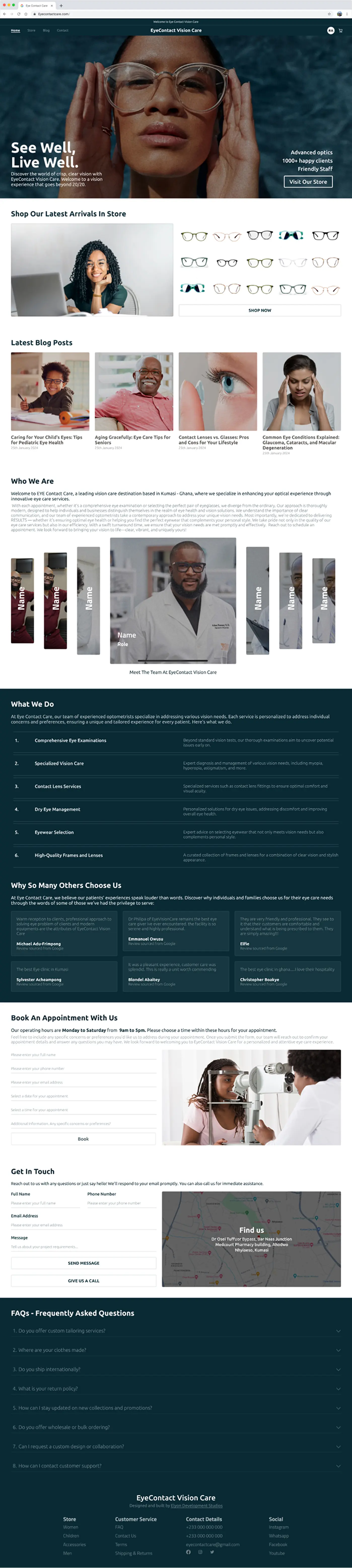
Scroll to view
Before the Redesign
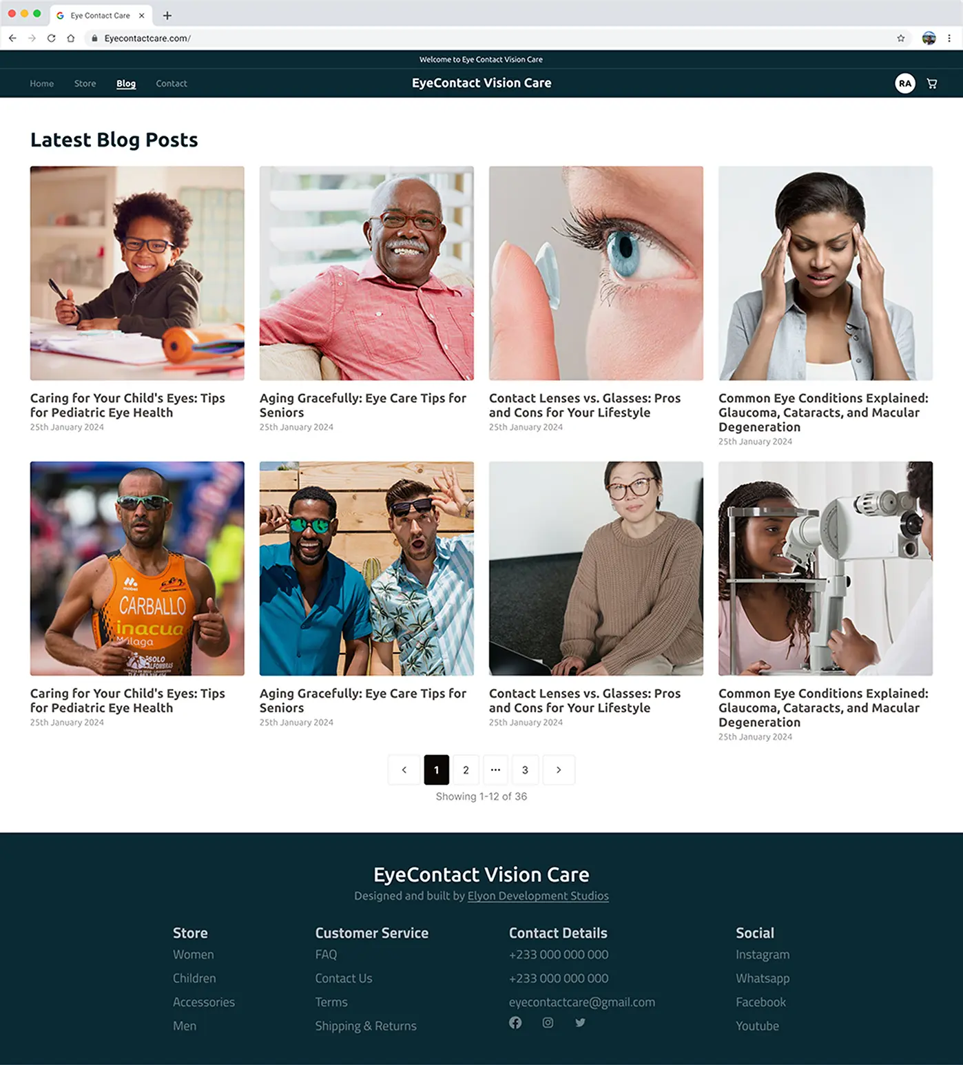
Scroll to view
Before the Redesign

Why did you design it this way?
The goal was to design a site that felt as clean and confident as the physical practice. That meant simplifying everything — clearer CTAs, more breathing room, better typography, and a more intuitive structure. We weren’t reinventing the wheel; we were just doing the basics, but doing them really well.
How did you approach the design?
- I broke it down into key focus areas:
- Homepage: Reduced clutter and focused on brand perception.
- E-commerce: Simplified the experience to make browsing and buying feel effortless.
- Booking: Gave appointment scheduling its own flow for clarity.
- Navigation & Footer: Cleaned up layout, reinforced branding, made it mobile-friendly.
- Overall visual system: Chose better typography, improved spacing, and stuck to a color palette that actually matched the physical brand.
What’s inside?
- A polished homepage with clear navigation and purpose.
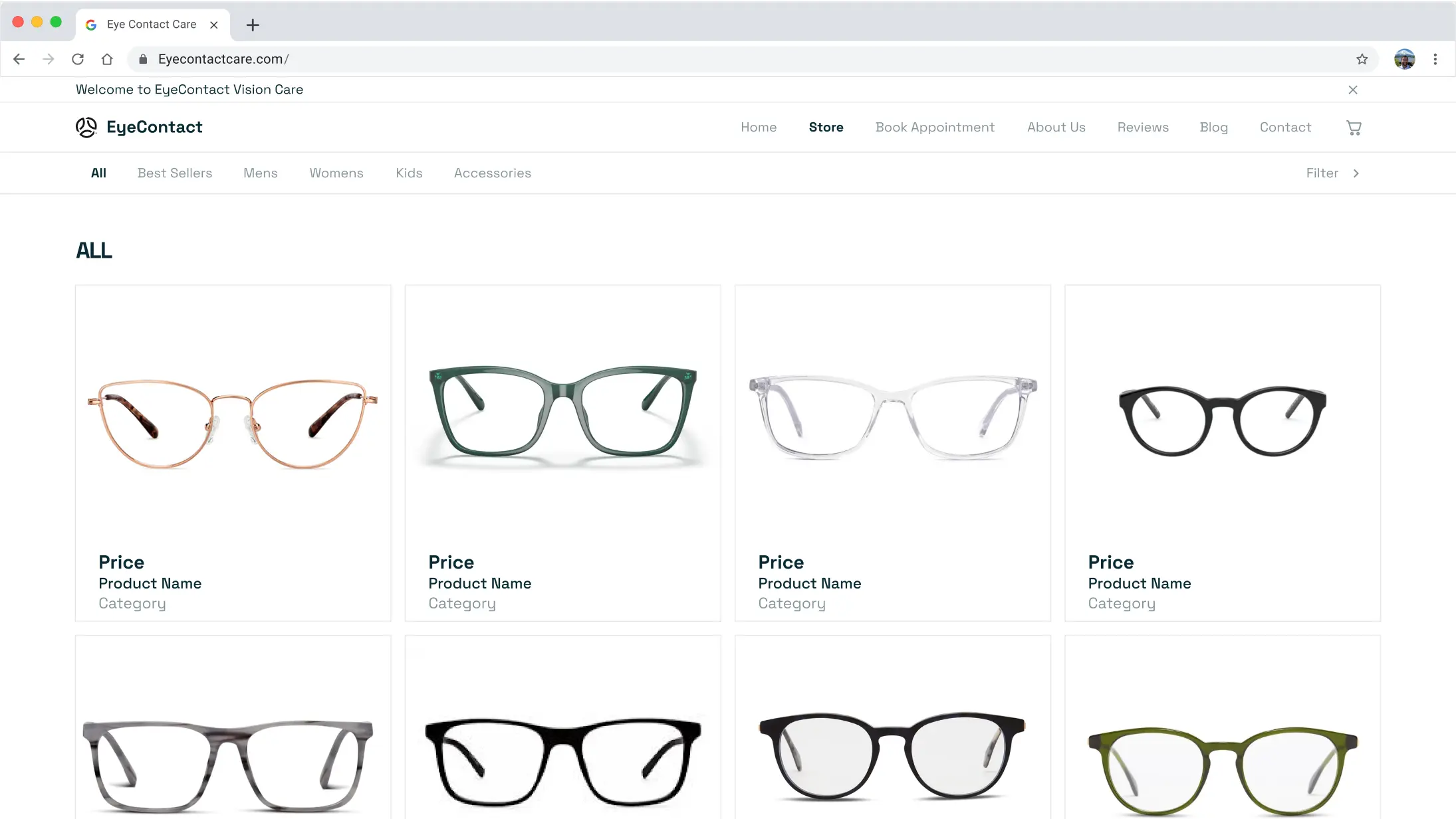
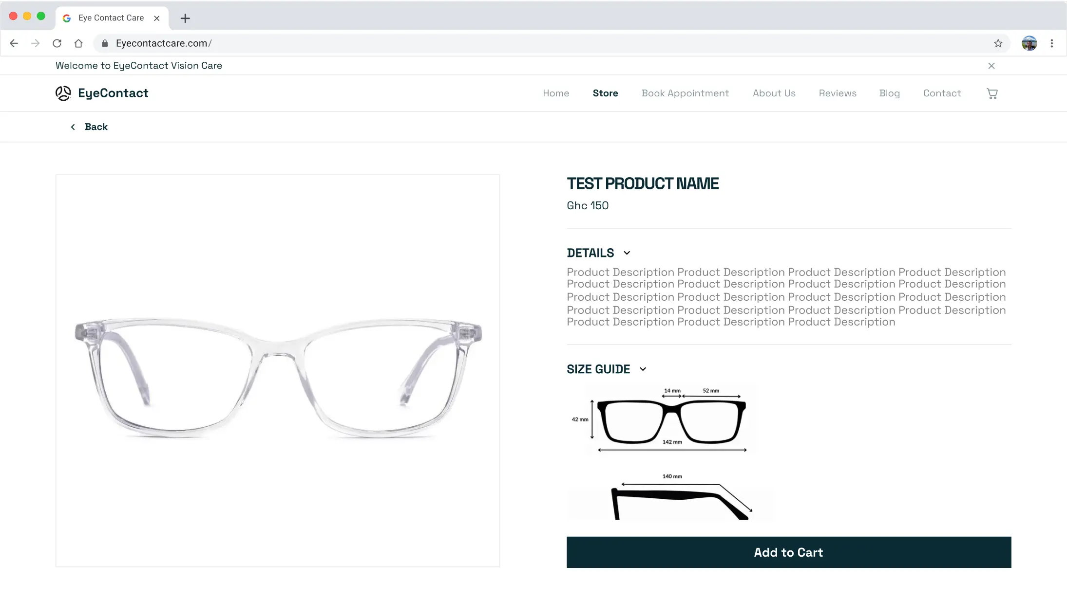
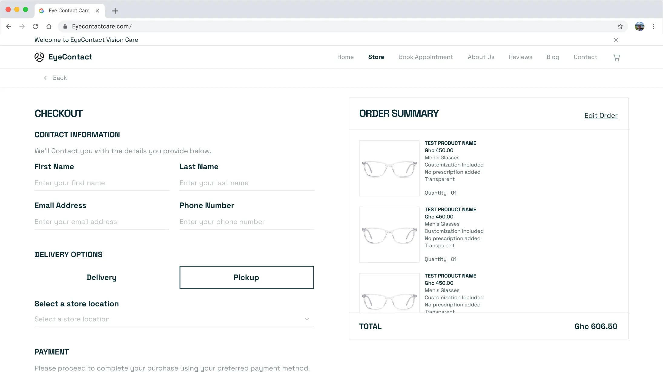
- A simplified online store for both prescription and non-prescription frames.
- A dedicated appointment booking flow.
- Refined layout and structure across all pages.
- Clean, responsive design that works beautifully across devices.
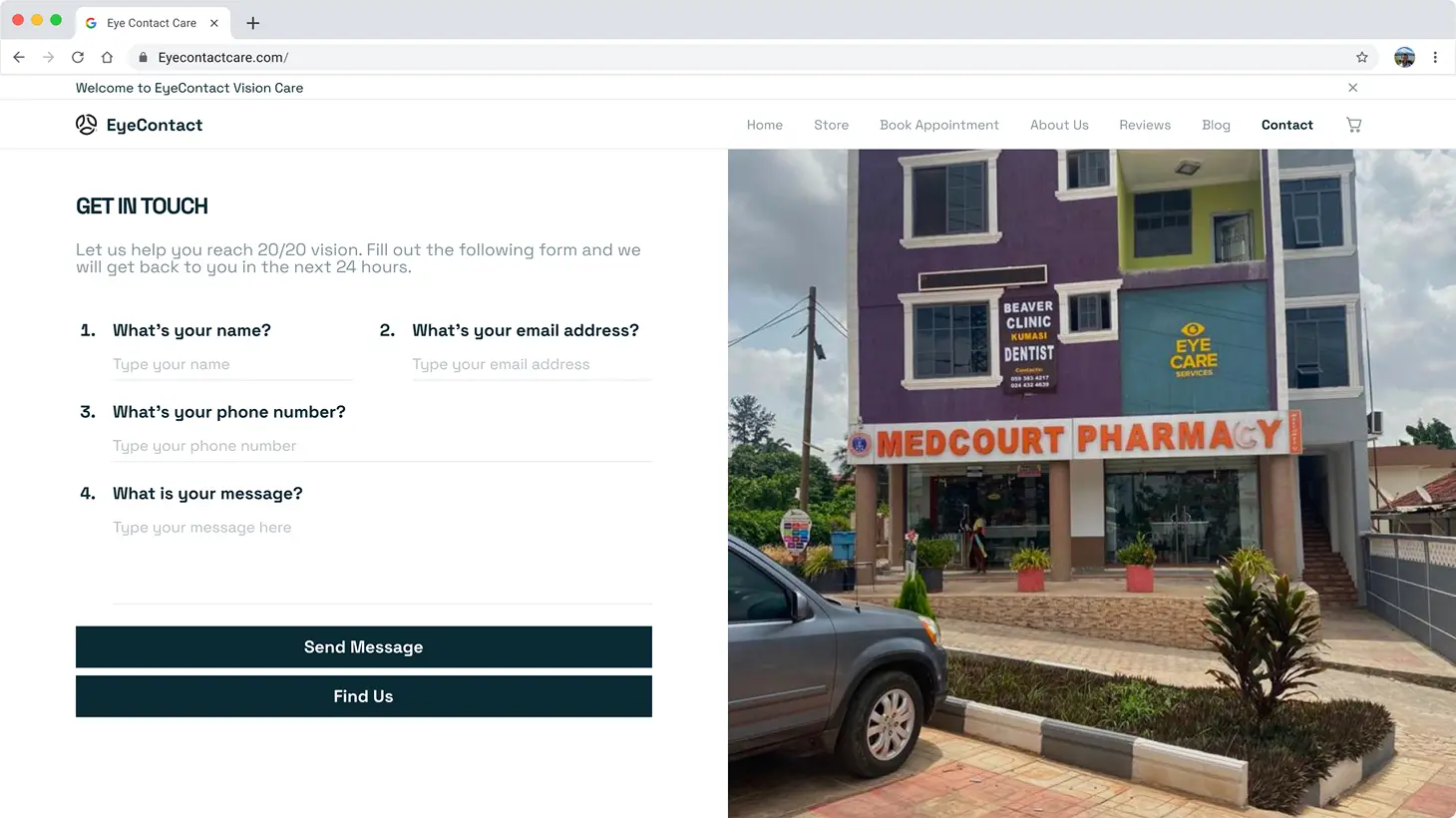
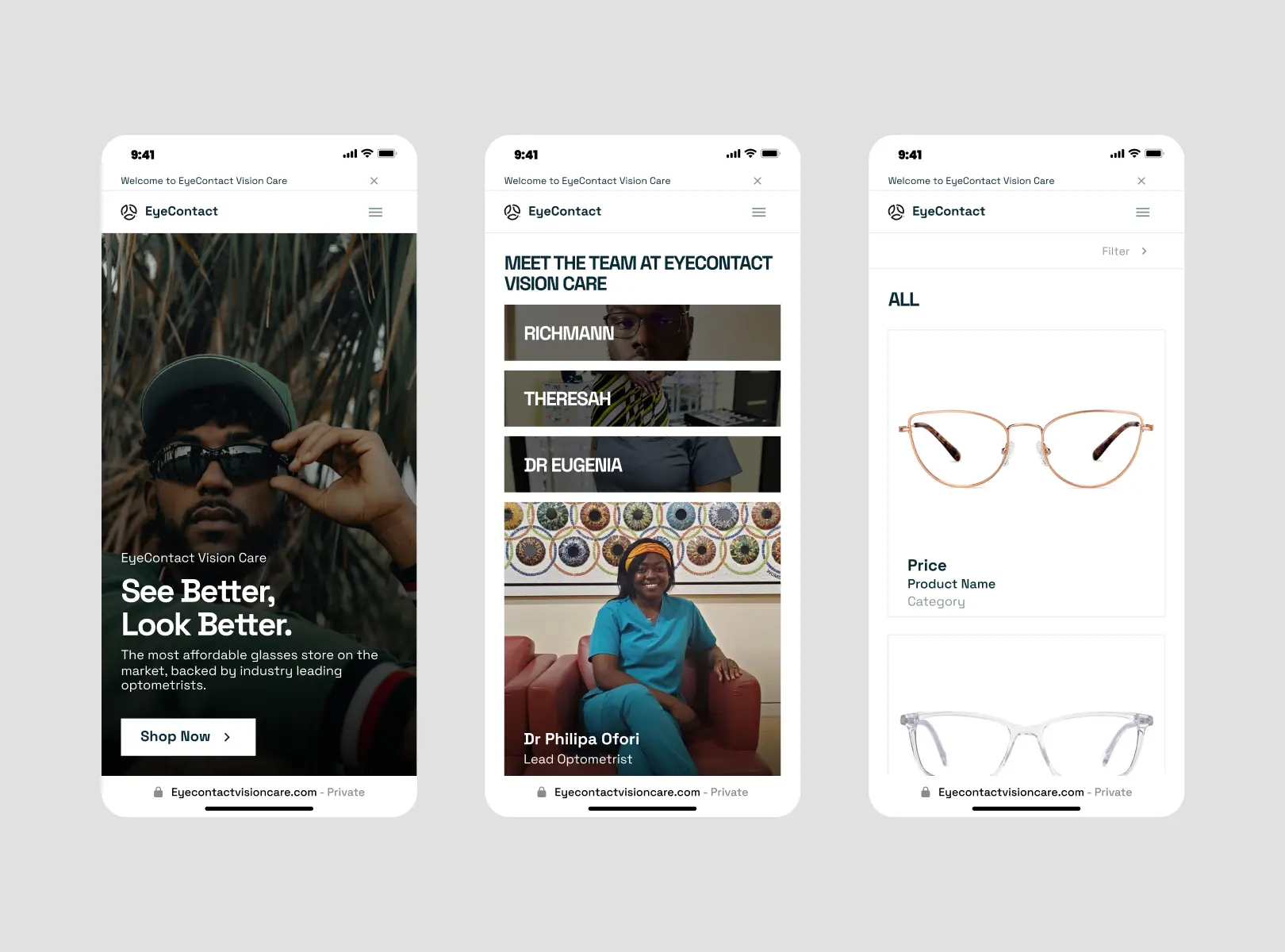
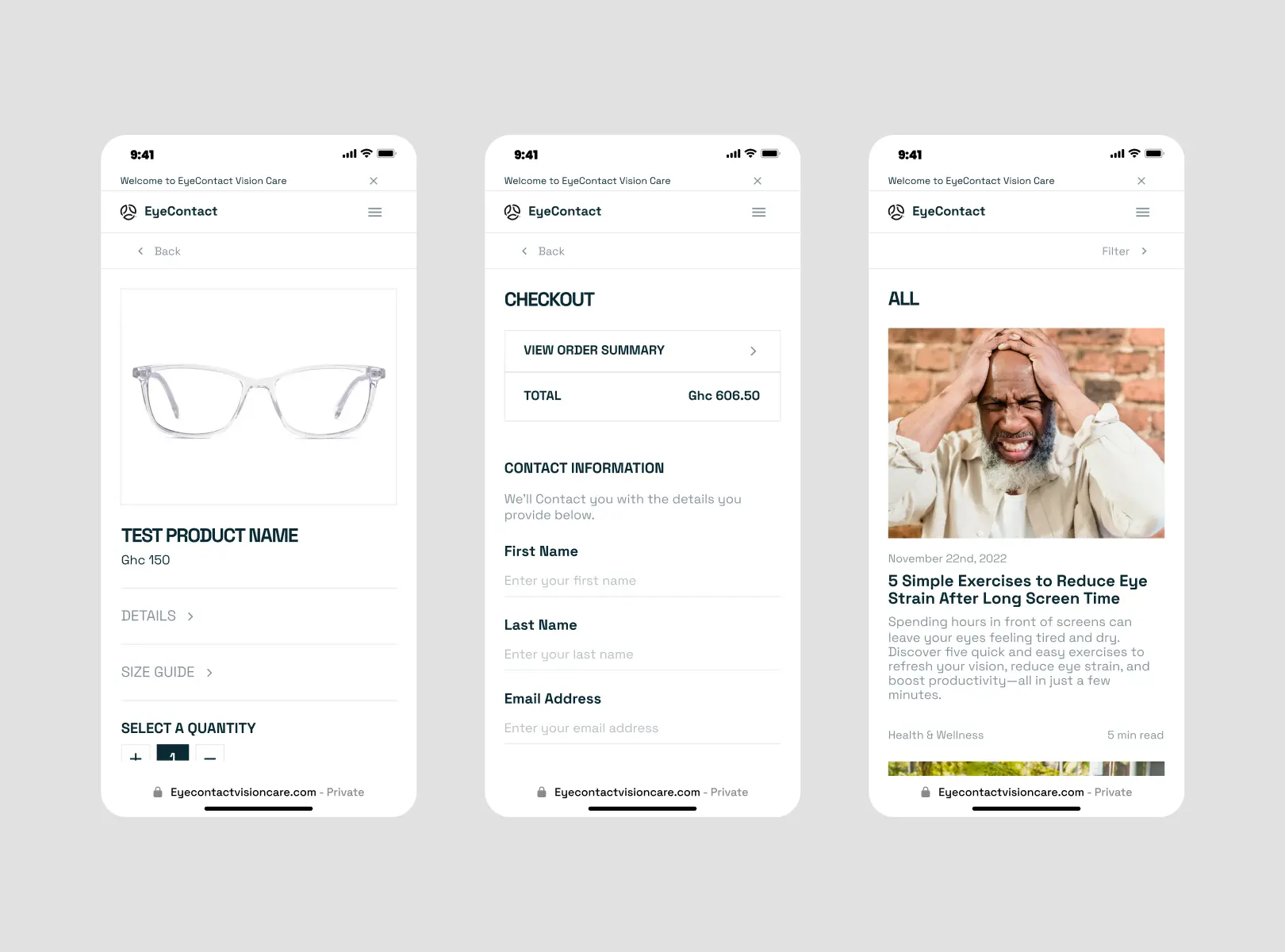
Updated design
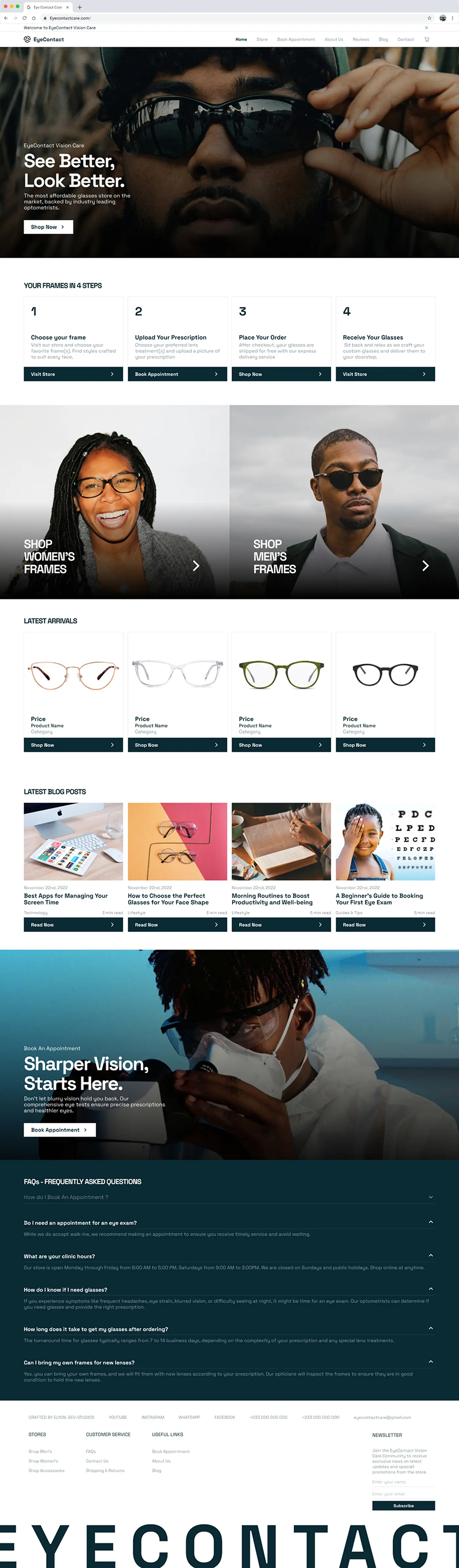
Scroll to view
Updated design
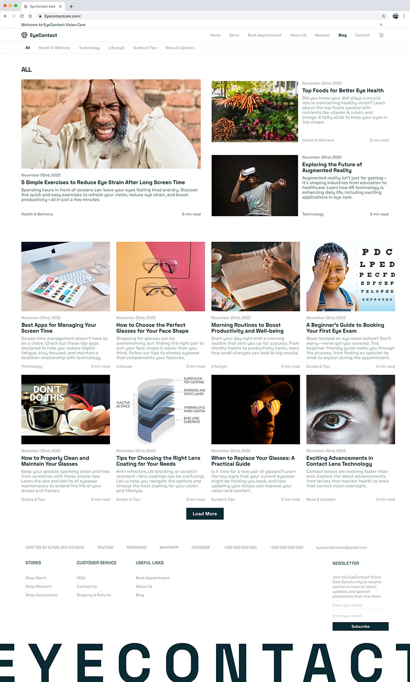
Scroll to view
Updated design
Updated design
Updated design
Updated design
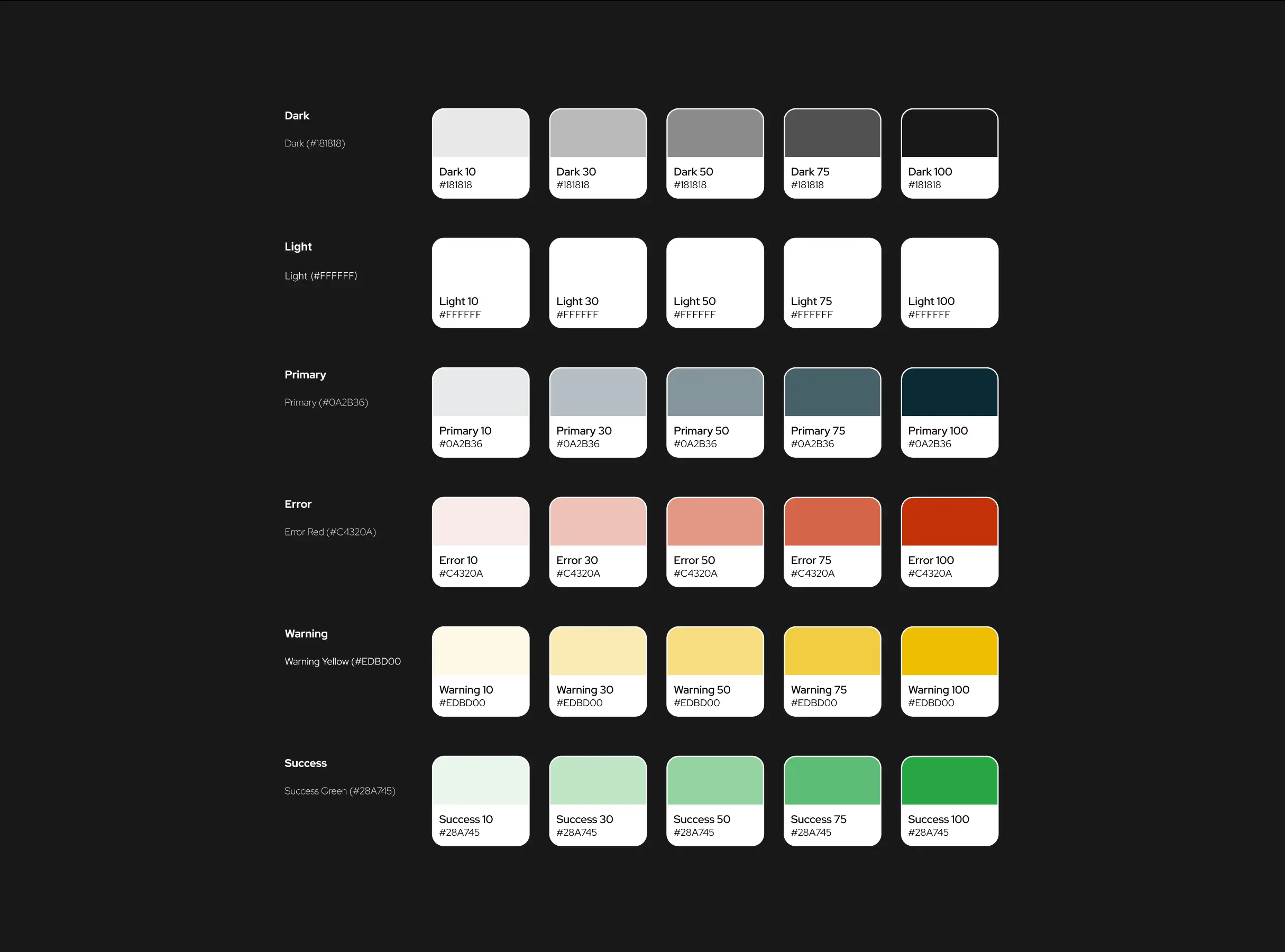
Colors
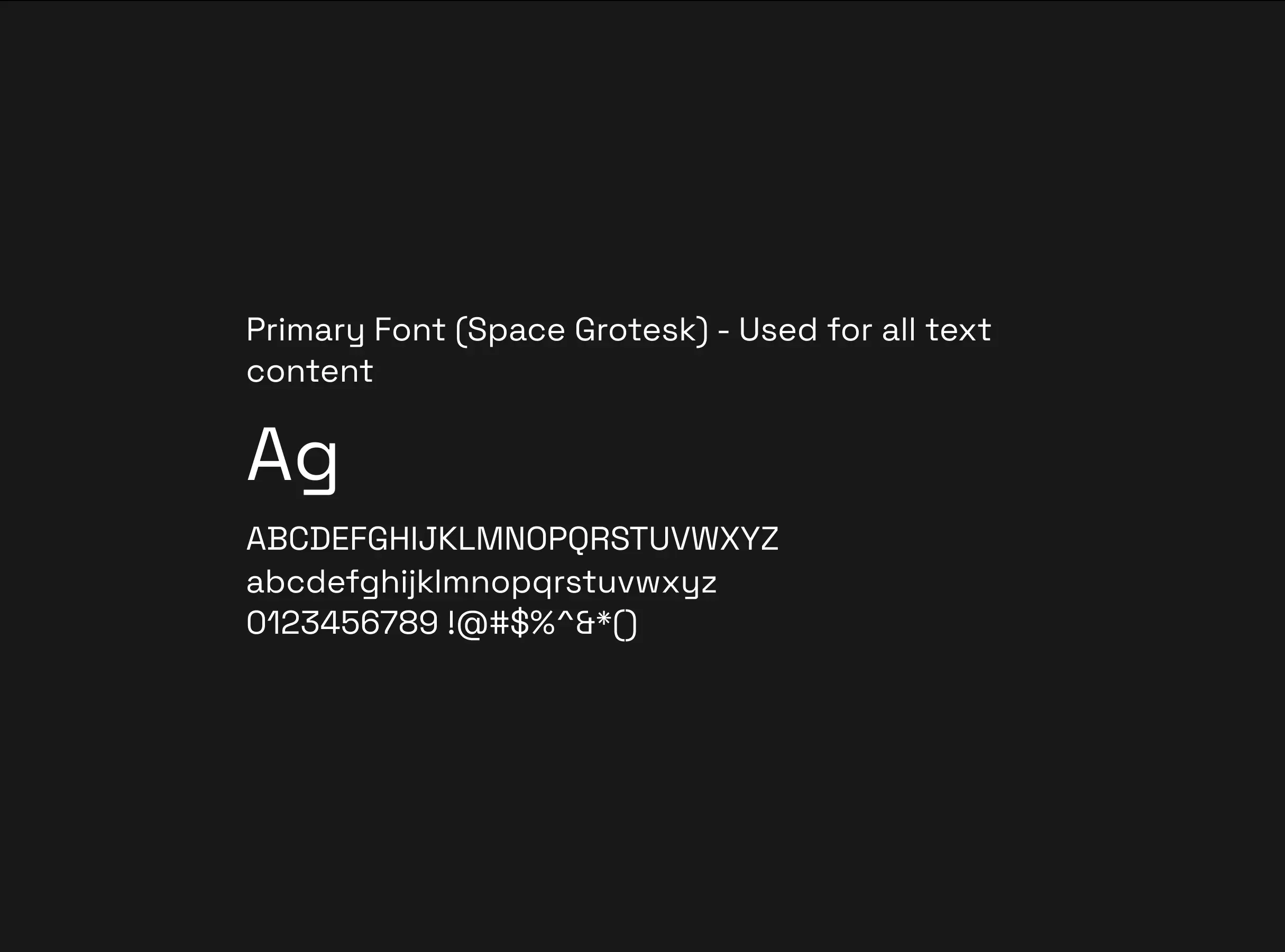
Typography
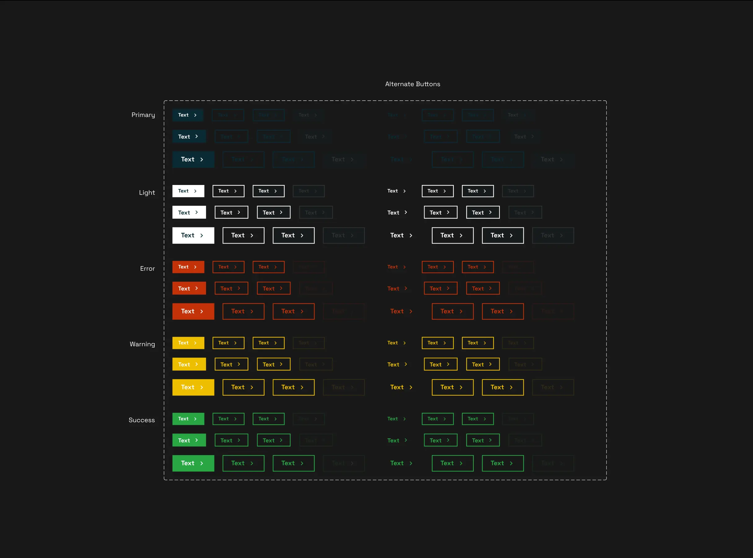
Buttons
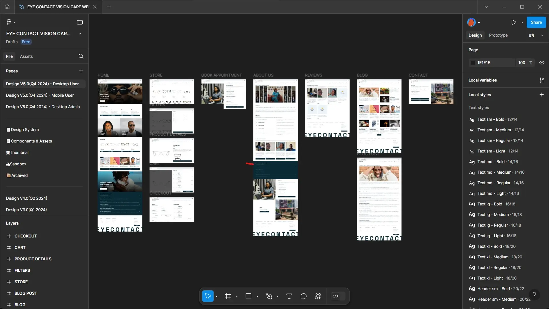
Figma Preview
Why does it matter?
In today’s world, the website is often the first impression. EyeContact’s physical space already nailed the in-person experience — it was time the digital one matched it. The redesign now builds trust, reflects professionalism, and makes it easy for users to take action.
What’s next?
The redesigned website is already live and functioning well, but there’s still room to refine. Future plans could include integrating a more seamless customer portal, supporting virtual consultations, and optimizing SEO to expand reach. But for now, the goal was simple: make the digital feel as good as the physical — and I did just that.