Richmann Addai
richmanaddai@gmail.com

On this page
Study House Case Study • 3 min Read
Back
1. Backstory
University felt like a group project no one was managing. Notes were
scattered across WhatsApp. Deadlines lived in people’s heads and
course materials sat in google Drives only a select few had access to.
Years ago this system probably worked, but now? Not so much.
There were tools, sure. But none that were well researched, optimized and
designed for the specific use case of Ghanaian university students. They
either felt too complex, too corporate, or just not in tune with what we
actually needed day to day. So I took on the challenge of Study House.
2. The Problem
Nothing was technically broken but everything felt like it was designed to suite as many use cases as possible. We were using a patchwork of generic tools including productivity apps built for different audiences, not sleep-deprived students juggling last-minute assignments, group work, campus life, and surprise quizzes during blackout hours. There wasn’t a single system built with an understanding of the Ghanaian university student experience which is the real, unfiltered version. A tool that helped students across Academic & Domestic touchpoints. Hence the challenge then became “How might we build such a system. A tool that solves this specific problem?”
3. What I Built
I built Study House. A digital toolkit for Ghanaian university students. It helps students:
- Stay on top of classes.
- Access notes, past questions, and study guides.
- Find verified services (like laundry and tutors).
- Access career tools and services (like job search ).
- Find and book uni accommodation (hostels, apartments, etc).
- And so much more.
But how did I get it to what it is now?
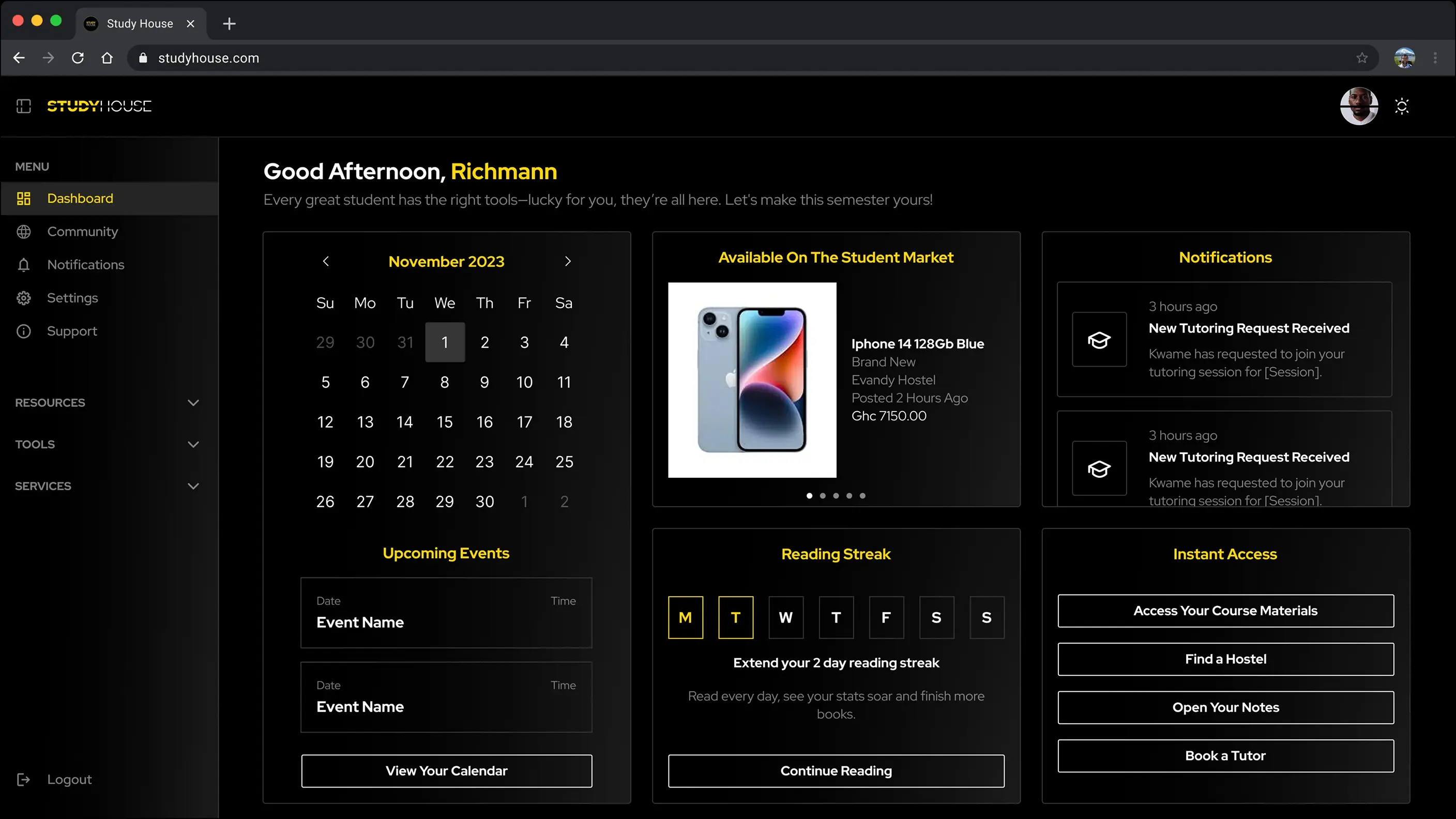
The Study House Dashboard: The one screen students land on every time. The goal here was to reduce cognitive load and make value obvious in less time.
4. My Role
I led research, UX, UI, copy, prototyping, validation, and full stack development. What I did includes but is not limited to:
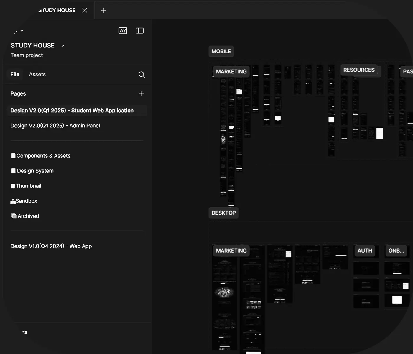
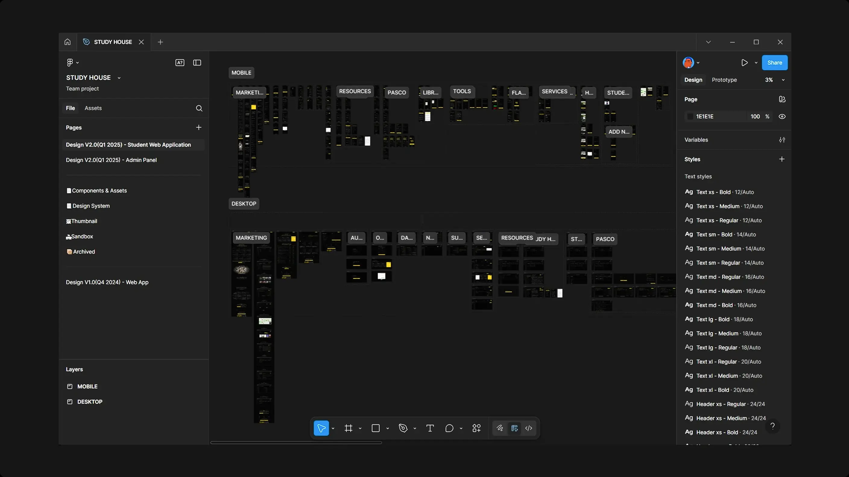
- Designing a fully responsive UI system in Figma.
- Writing code with Astro + Vue & Supabase for speed and flexibility.
- Writing all microcopy, system flows, and onboarding logic.
- Validating decisions through direct student feedback loops.
5. Product Thinking & UX Principles
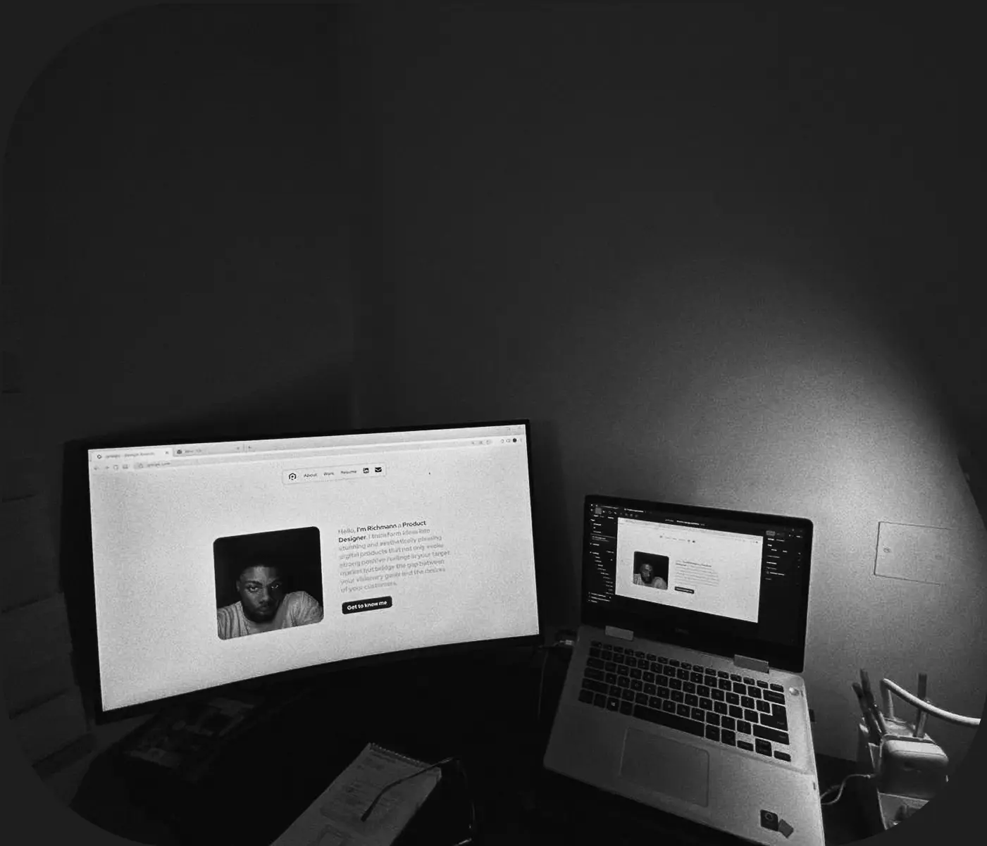
This wasn’t a UI-first project.
I made the classic mistake of jumping straight into Figma because I’d
lived through the problem, and so assumed my experience reflected everyone
else’s.
I skipped research at the onset, thinking I already
knew what students needed. I wasn’t 100% correct. Eventually, I hit
friction and had to pause, go back, and do the research I should’ve
started with. What I found corrected my thinking and in some cases
validated my earlier assumptions which gave me the greenlight to go
on ahead.
In essence, this was behavior-first project. I had to respect how students
really behaved. Students were stressed, mostly easily distracted, and
short on time and design the experience for selected features around
that reality, not against it.
So the UX had one job:To
get in, get value, and get out.
The core principles that shaped the design included but are not limited
to:
- Cognitive load reduction: one screen, fewer decisions
- Progressive disclosure: show only what’s needed, when it’s needed
- Predictable flow: never lost, never confused
- Contextual Accessibility: offline-ready, fast-loading, and mobile-first.
This wasn’t a “more features = better product” play. It was about
saying no and building only what earned its spot. Every
interaction was validated with real students. I stripped away
complexity, kept what mattered, and optimized for how students
think and not how I wish they did which was my mistake in the
earlier stages of design.
Here’s a look into a few key UX decisions I took during the design
process
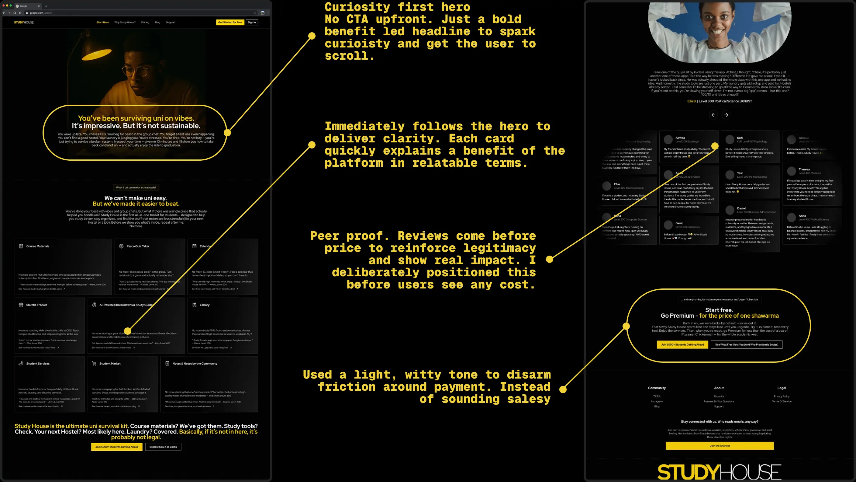
a. Marketing: My process of guiding new students through psychological principles
The landing page was structured around user awareness levels. Guiding students from “What is this? and how would it help me” to “Sign me up please”. Each scroll section solves a doubt or builds enough curiosity to nudge them closer to action
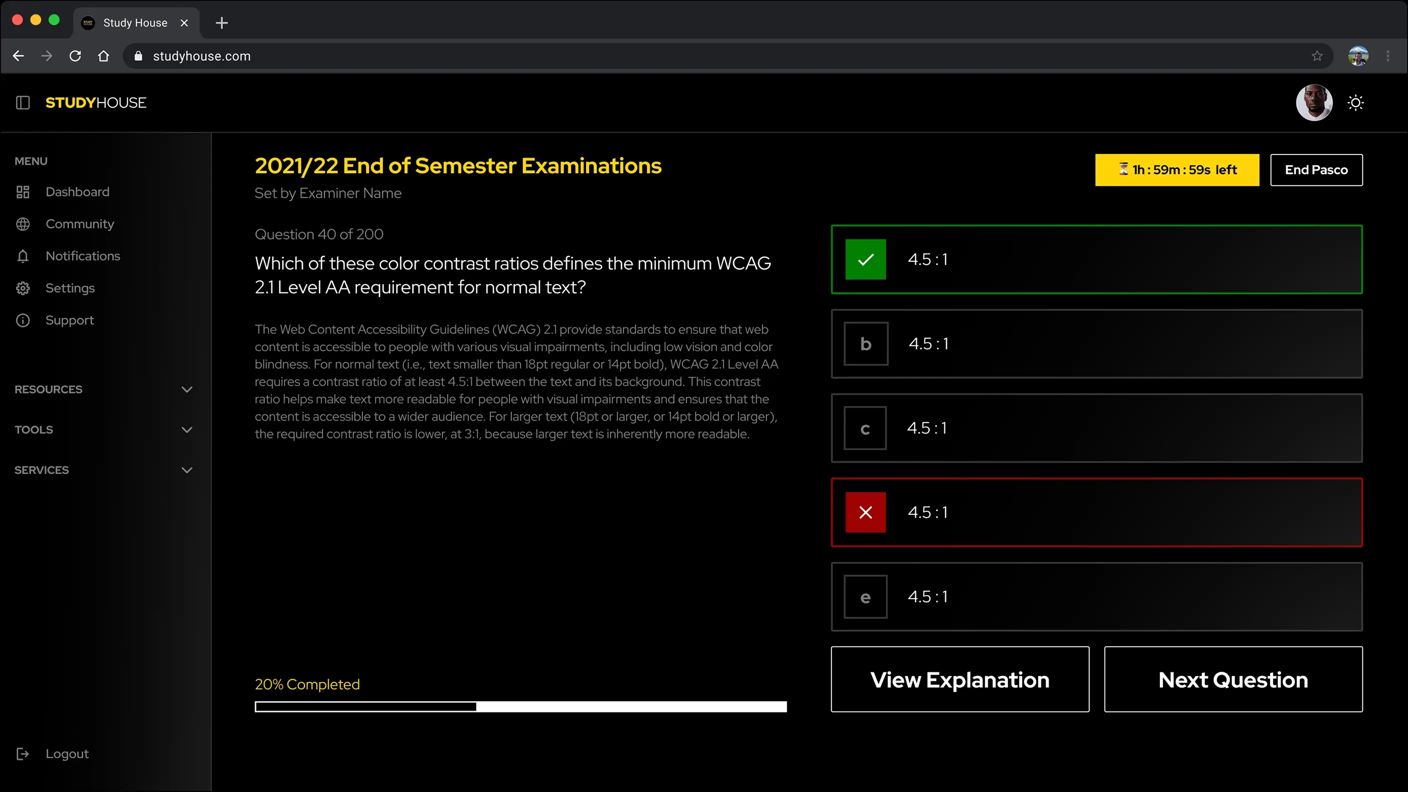
b. Tools(Quiz App): The process of creating reinforced learning through instant feedback
I could’ve given students a bunch of questions and answers and
called it aa day. Instead I turned that experience into a Quiz app
to reinforce what they learn. The Quiz App design shows them the
correct/wrong answer immediately after selecting an option with
another option to show an explanation, so the lesson sticks.
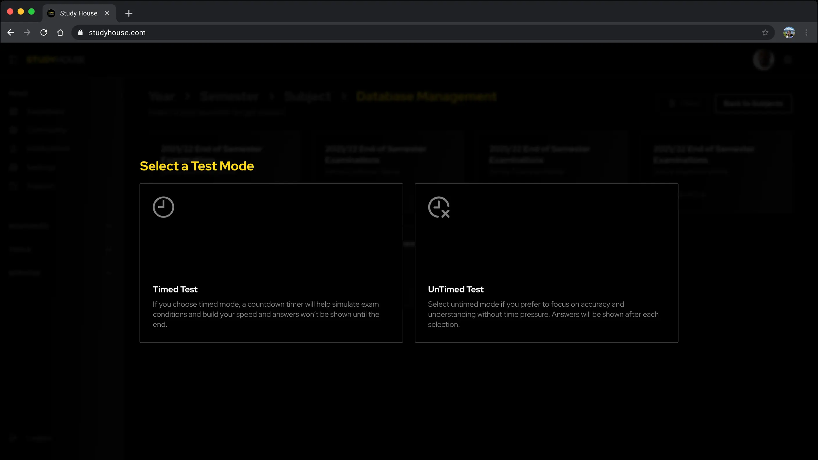
Furthermore I designed the Quiz app to come in two modes. The timed mode
simulates real exams whereas Untimed is for low-pressure practice.
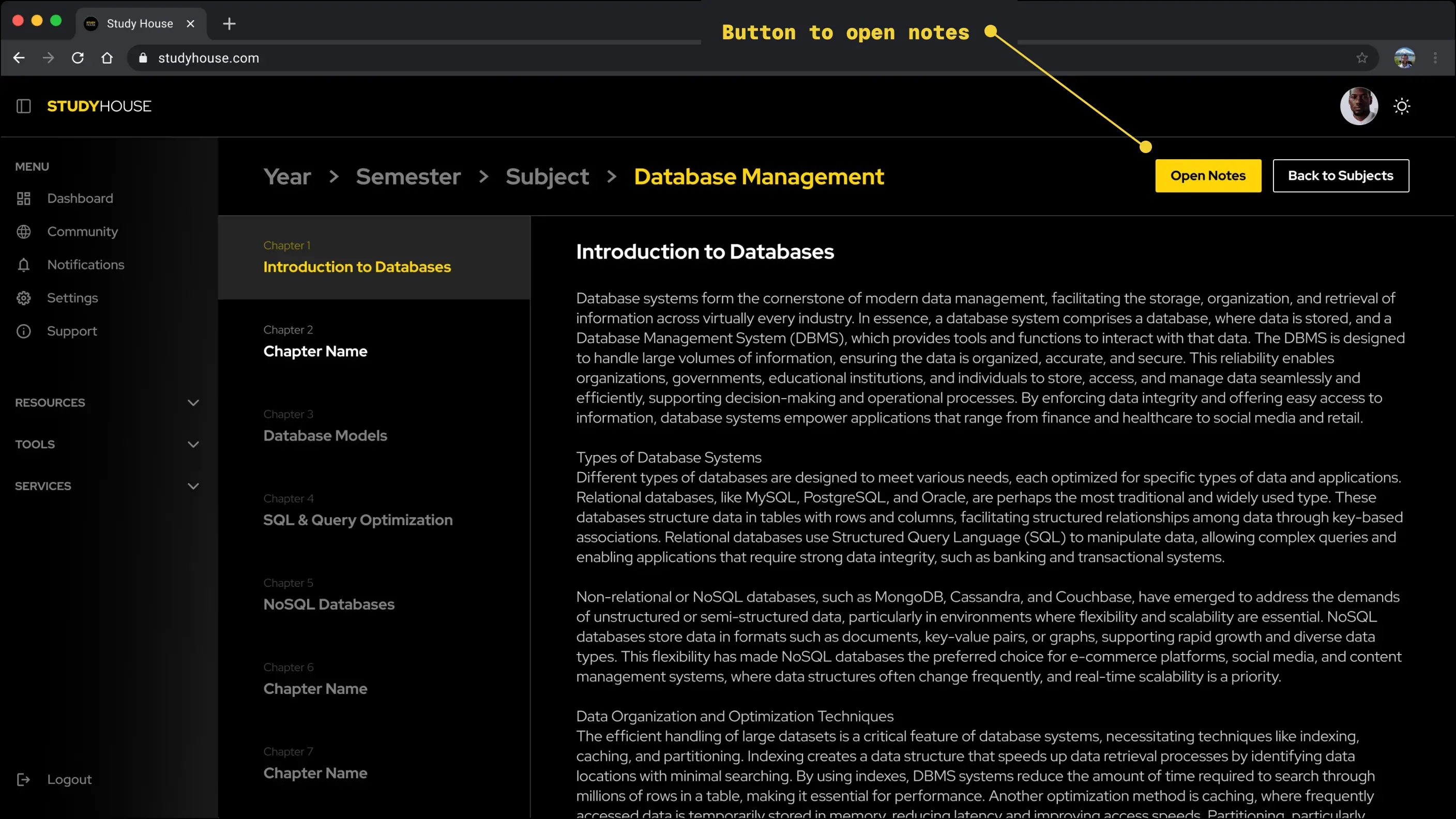
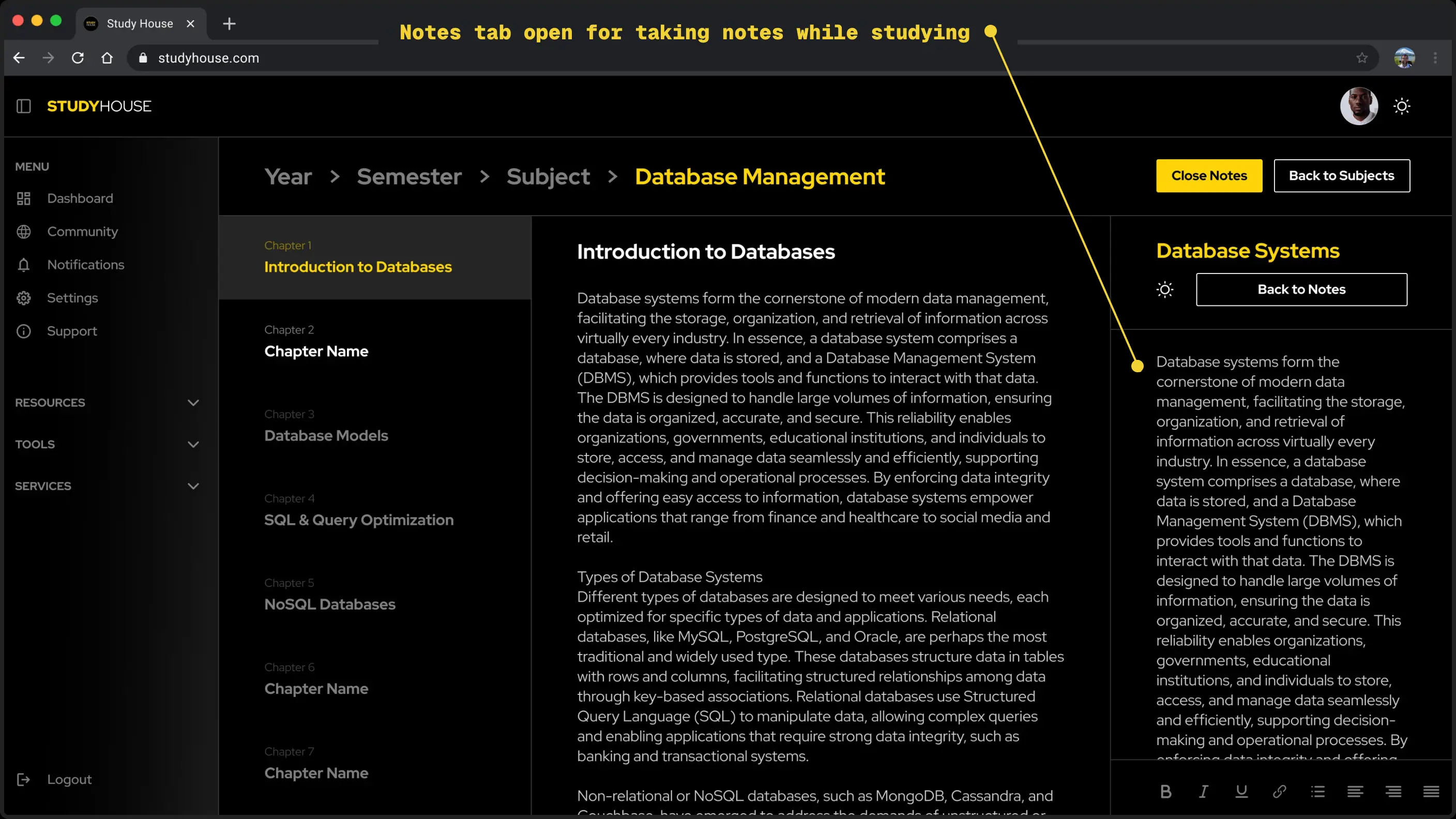
c. Notes That Stay With You
I observed students often took notes while studying, so I added a button to open the notes application in a side tab whenever studying course materials or using educational content on the platform that would’ve required note taking. I did this to reduce context switching and give them a more pleasant experience.
d. Responsive Across Devices
I designed every core experience to feel just as easy-to-use on mobile.
I made sure every feature, big or small ,was designed with intention and backed by research on how students behaved.
6. What I Learned
- Good structure matters because juggling multiple complex features (notes, reminders, jobs, services) while keeping the structure of the interface understandable and coherent can be complex but essential nonetheless.
- Great UX is invisible, but research always leaves a visible fingerprint.
- Supabase’s way of doing advocates for consolidation after Kaizen. This was golden advice and I leaned on this during the creation of Study House.
- Most importantly, I learned to step out of my own bubble. This wasn’t “build it and hope.” It was conversations, tests, critique, and iteration until the thing actually worked.
7. What’s Next?
Study House is far from done. The foundation’s is set but the
vision is bigger.
We’re exploring:
- AI-generated study plans that adapt to your schedule
- Better verification for student services (no more scammy flyers)
- Built-in career prep tools
- School partnerships to integrate real-time academic data
- More ways for students to help each other (community tutoring, peer support)
8. See study house Live
Coming Soon